New Year, New Packaging Trends
Contrary to what you may have learned in elementary school, the concept of “judging a book by its cover” plays a positive and essential role in marketing a new product. While it’s still the inside that counts, the outside packaging represents a crucial (and potentially first) step in attracting consumers. Not only are shoppers consciously looking for new and exciting trends, but psychological factors affect who buys your brand –without the buyer even realizing it.
Essentially, your product should scream, “Pick me!” without making a sound. Relying on imagery, color scheme, texture, and shape, your brand can speak wonders.
We’ve looked into emerging trends for packaging to find out just what consumers will knowingly and unknowingly be drawn to in the New Year. As Rich Cohen, founder and president of Distant Village Packaging, put it, brand packaging must be seen at as a “silent salesperson”. Turns out some of our clients are already ahead of the new trend game – here’s a look at their clever and effective packaging.
Color
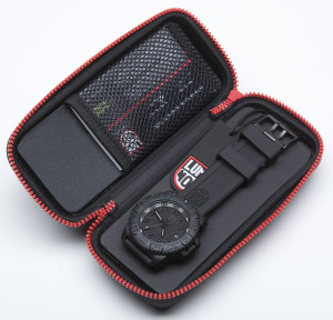
Have you ever been looking at an ad when suddenly your hunger skyrockets? Well, there’s meaning behind this. Certain colors like yellow, red, and orange are known to spike appetite, as well as create a sense of energy and excitement. Cooler colors like green, blue, and white stir up feelings of calmness and security, explaining why they’re usually used for spa-related products. Luminox capitalizes on this color trend, using black and red in their watch packaging design. Along with the energy and passion of red detailing, the black boxes convey a sense of prestige that the product, true to its broader brand message, upholds.
Size & Shape
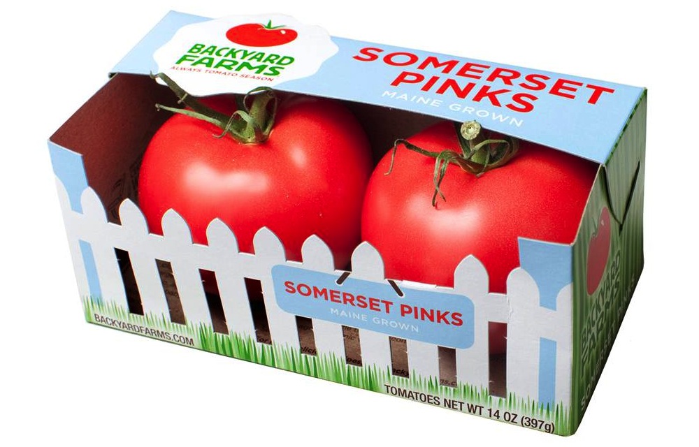
Size and shape also play a crucial role in the impression a product makes on a consumer. The shape of the package can tell a story about the product, for example. Backyard Farms employs this, packaging its tomatoes in boxes that mock an actual fenced-in backyard. Backyard Farms provides a fresh-from-the-garden tomato, and this message is translated in the brand’s package design. In addition to telling a story, shape can convey other subconscious values: rounder packaging emanates a softer, feminine feel, while hard edges translate to toughness and masculinity.
Design Aesthetic
The general aesthetic of your packaging can make or break a final sale. Recently, consumers have been reaching toward more authentic and “natural”-looking packaging. They favor homemade designs over utilitarian ones, as “hominess” tends to produce honest, quality, and caring associations. Stonewall Kitchen’s packaging is a successful example of this design tactic. Each of the brand’s jars of mustard and bottles of sauce is labeled with soft, casual, handwritten-esque typography. It’s as if your grandmother just whipped up a batch of her famous blueberry jam, and attached a specially crafted personal note. And who doesn’t love grandmother’s jam?

So go for it, try the colorful box or rustic jar; some brand manager spent a lot of time creating it just for you. We bet it tastes or works as good as it looks.