It all started in late December when Verizon let the ball (or should I say balls) drop by debuting a new commercial claiming that their performance was 1st in the US for data, calls, speed, and reliability. The ad was titled, “A better network as explained by colorful balls.”

In the commercial, the four major US carriers including Verizon, Sprint, T-Mobile and AT&T each have their own colored balls that race down a path and into their own designated pool. Verizon wins the race, displaying their superiority over the other brands while supporting the credibility of their RootMetrics study.

Verizon was obviously hoping to see a response from consumers, resulting in new customers and higher sales. However, what they didn’t foresee was the response they would get from competitors they’d just thrown under the bus.

T-Mobile’s commercial, titled, “The rest of the story,” accused Verizon of omitting information, claiming they have added coverage for 100 million people in the last two years. The ad ended with, “Verizon didn’t tell you that, did they?” – a clear shot at the rivaling brand.

Sprint felt the need to get in on the action, as well, defending themselves in a commercial titled, “Sprint Presents: Nice Try Verizon.” In the commercial, they too accuse Verizon of leaving out information, claiming that they have the fastest download speeds than any other carrier.

How’s that for a little competition? The good news for us is that while these leading carriers fight over who is better, it is the consumer who ultimately wins. Both Verizon and Sprint offer to pay for the fees to change carriers, which can sometimes be several hundred dollars. Sprint also started a promotion that cuts their rates in half. Not too shabby a deal.

Better offers and new campaigns make the prospect of changing carriers more appealing, showing the prevalent nature – and the continued effectiveness – of comparative advertising.

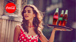
For the last seven years, Coca-Cola’s “Open Happiness” campaign provided a mantra that connected the brand and its consumers in a remarkable way. With clever ad approaches and recognizable exposure, Coca-Cola established a movement that associated the brand with philosophical and psychological happiness. But with the attention on the brand itself for nearly the last decade, Coca-Cola recently saw fit to put focus back on the products and get its consumers to re-commit to the brand’s actual beverage offerings.

Screen Shot 2016-01-26 at 10.50.18 AM

[Source]

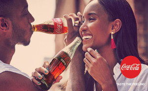
Coca-Cola’s new campaign “Taste the Feeling” was released last Tuesday with an abundance of new print and video advertisements to refocus Coca-Cola’s consumer base on the actual product in the bottle: that sugary sweet good stuff we all love to love.

The “Taste the Feeling” campaign, using their ‘One Brand’ strategy, has a very direct goal: to connect the Coca-Cola brand on a global level. While stressing the global campaign, Coca-Cola will strive to reinforce the notion that consumers choose Coca-Cola products – across all of its trademarks – based off of their preference and lifestyle choices.
coke-taste

[Source]

The company intends to encourage consumers that their lifestyles already align with sugary Coca-Cola products, but in doing that, one can’t ignore how the global shift to healthier lifestyles puts a strain on Coca-Cola; while they are a completely successful brand, they’re fundamentally ignoring the bigger picture. Although the company offers ‘smarter’ lifestyle choices, the consumer base is still looking for a more revolutionary product that supports the movement to living a healthier life. Can the ‘One Brand’ strategy and the “Taste the Feeling” campaign serve to reconcile that gap between lifestyle and preference?

Whether you see it as a futile quick-fix, or as the tip of an iceberg that represents a huge step soda makers must one day take, with its new approach, Coca-Cola is ready to take you back to your special moments and remind you of the feelings associated with one of the world’s most beloved drink brands. The full set of “Taste the Feeling” television ads can be found on Coca-Cola’s YouTube page, but you can check out one of the commercials, which covers Queen and David Bowie’s song “Under Pressure”, below!

Contrary to what you may have learned in elementary school, the concept of “judging a book by its cover” plays a positive and essential role in marketing a new product. While it’s still the inside that counts, the outside packaging represents a crucial (and potentially first) step in attracting consumers. Not only are shoppers consciously looking for new and exciting trends, but psychological factors affect who buys your brand –without the buyer even realizing it.

Essentially, your product should scream, “Pick me!” without making a sound. Relying on imagery, color scheme, texture, and shape, your brand can speak wonders.

We’ve looked into emerging trends for packaging to find out just what consumers will knowingly and unknowingly be drawn to in the New Year. As Rich Cohen, founder and president of Distant Village Packaging, put it, brand packaging must be seen at as a “silent salesperson”. Turns out some of our clients are already ahead of the new trend game – here’s a look at their clever and effective packaging.

Color

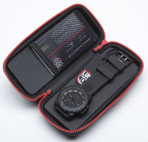
Have you ever been looking at an ad when suddenly your hunger skyrockets? Well, there’s meaning behind this. Certain colors like yellow, red, and orange are known to spike appetite, as well as create a sense of energy and excitement. Cooler colors like green, blue, and white stir up feelings of calmness and security, explaining why they’re usually used for spa-related products. Luminox capitalizes on this color trend, using black and red in their watch packaging design. Along with the energy and passion of red detailing, the black boxes convey a sense of prestige that the product, true to its broader brand message, upholds.

luminox2

Size & Shape

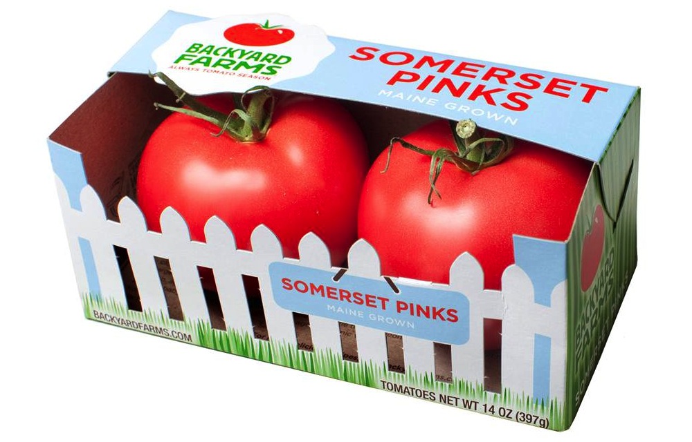
Size and shape also play a crucial role in the impression a product makes on a consumer. The shape of the package can tell a story about the product, for example. Backyard Farms employs this, packaging its tomatoes in boxes that mock an actual fenced-in backyard. Backyard Farms provides a fresh-from-the-garden tomato, and this message is translated in the brand’s package design. In addition to telling a story, shape can convey other subconscious values: rounder packaging emanates a softer, feminine feel, while hard edges translate to toughness and masculinity.

tomatoes

Design Aesthetic

The general aesthetic of your packaging can make or break a final sale. Recently, consumers have been reaching toward more authentic and “natural”-looking packaging. They favor homemade designs over utilitarian ones, as “hominess” tends to produce honest, quality, and caring associations. Stonewall Kitchen’s packaging is a successful example of this design tactic. Each of the brand’s jars of mustard and bottles of sauce is labeled with soft, casual, handwritten-esque typography. It’s as if your grandmother just whipped up a batch of her famous blueberry jam, and attached a specially crafted personal note. And who doesn’t love grandmother’s jam?

SWK

So go for it, try the colorful box or rustic jar; some brand manager spent a lot of time creating it just for you.  We bet it tastes or works as good as it looks.


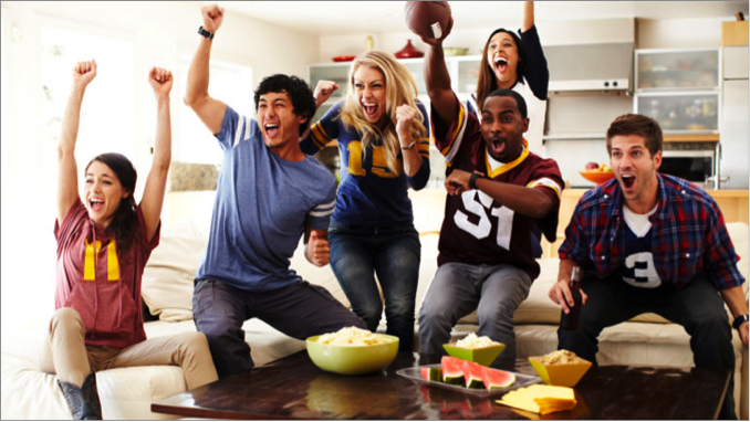
Around the beginning of every year, America begins to get excited for what some might consider to be an unofficial national holiday: Super Bowl Sunday. Fans of the two combatting teams strap in for what they hope to be a victory for their favorite city. Others tune in for the love of football or the spectacle that the Super Bowl has become.

Blog pic

One thing is for sure; everybody who turns on their TV on February 7th is going to be excited to watch this year’s Super Bowl commercials. Companies pay premium prices for a chance to put out their most polished commercial during the game and, according to the stats, it’s paying off.

Here is a sneak peek at what we can expect for this year.

Successful 2015 Campaigns Returning to the Big Stage

  • Intuit will once again give a 30-second spot to the finalist of its “Small Business, Big Game”, while TurboTax will use its own spot again in 2016
  • Online services Squarespace and Wix will be back
  • After a shocking hit in 2015, Avacados From Mexico announced its return
  • Kia, Mini USA, and Toyota will be coming back this year to show off some of their new cars

Making a Comeback

  • Plenty of car companies will return after missing the action in 2015, such as Acura, Buick, and Honda
  • Taco Bell announced its return in the form of a redacted press release
  • Butterfinger reeled out its intentions for its “Bolder than Bold” campaign in bold fashion

Big Surprises

After a string of serious Super Bowl commercials in 2015, the general tone of 2016 should be much lighter. (As this New York Times article puts it, marketers just want to have fun again.) With that in mind, there are bound to be plenty of laughs, as well as more surprises, for viewers on game day. Oh… and there’ll be some football, too.