Tag Archive for: Snickers

It’s 11:00 AM. Too late for a post-breakfast snack but too early for lunch. You’re in culinary limbo.


As you sit at your desk listening to your stomach serenade you, your merciless mind races with thoughts of vicious things you would do for some grub right about now. SNAP OUT OF IT! You’re not you when you’re hungry – and Snickers understands.


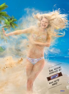
A recent Snickers ad demonstrates the consequences of letting yourself get a little too hangry. Strategically placed on the back cover of Sports Illustrated’s Swimsuit Issue, the ad shows a beautiful model whose hair floats beside her head, whose belly button is near her chest, whose hand has been digitally placed onto her shoulder sans arm, and whose image, poor girl, has suffered multiple other repercussions of poor Photoshopping. The copy reads, “Photo retouchers get confused when they’re hungry.” Another ad from the campaign features a distraught, wind-blown model with copy that reads, “Wind machine operators get loopy when they’re hungry.” Clearly, these mistakes could have been avoided, had the workers had a Snickers bar.


snickers-retoucher-1

snickers-retoucher-2


With this new campaign, Snickers sought to revamp their now six-year-old motto, “You’re not you when you’re hungry,” in a fun and hyper-targeted way. Using minimal copy, Snickers challenges audiences to interact with the former ad by finding all 11 retouching errors. While it seems the rest of the world is focusing on technological advancements, Snickers proves that print advertising ain’t about to be a #TBT just yet.


Considering Sports Illustrated’s religious use of Photoshop, the placement of these ads is significant and ironic. Luckily, Snickers was able to bring attention to the absurdity of retouching in a lighthearted, fun way, thus functioning successfully alongside its outlet and, therefore, its audience, rather than against them.


Not only does the campaign get an A+ for creativity, its timeliness is on-point, as well. Sports Illustrated model Ashley Graham recently announced that her 2016 cover is au naturel and entirely untouched. Looks like the magazine is taking the appropriate steps toward combating its notorious reputation by stepping out of its comfort zone to recognize real, natural women for the first time in history. And the Snickers ad, it seems, is the perfect cohort in this effort.


While the ads are proving effective in the states, we’ll have to keep tabs on the brand’s performance abroad, due to a recent product recall in the Netherlands.  Maybe Snickers factory workers should start practicing what they preach–hunger always gets the best of us!


[SOURCE]

Sometimes it can be hard to fit in everything you want to show off about a product in the span of a 30-second TV spot. That being said, when that time slot alone costs upward of 4 million dollars, you don’t have much of a choice.

This year, many of the Super Bowl ads that resonated with us were the ones that developed – however briefly – a strong story. Of course, a simple story line isn’t an automatic recipe for success, but it’s still a good start to creating an emotional tie between the viewer and the brand.

Looking through the lens of this year’s Super Bowl ads, let’s take a peek at three key ingredients for memorable storylines.

1. Originality. For some advertisers, originality was a challenge this year. Anyone else notice an abundance of father-centric ads? It makes sense; it is the right target audience.  Watching the Super Bowl is often thought of as a father-son or father-daughter activity, which resulted in more than one brand using this as an angle to approach their viewers. Amongst all the dad spots, it quickly became hard to stand out. Particularly, both Toyota and Nissan focused on this story line: developing a relationship between a father and child. This is even more confusing since they target similar segments – and coincidently are both car brands. The concept may be a memorable one, but there’s a big chance people who saw both ads will confuse the brands behind them.

2. Leverage Well-Known Characters. Another trend this year’s crop of Super Bowl ads displayed was the value of already established characters. When trying to tell a story in a short time span, using easily referable characters avoids timely introductions and saves precious seconds. Snickers made the most of the technique, with a Brady Bunch-themed commercial featuring Steve Buscemi and Sons of Anarchy’s Danny Trejo.

3. Use Real People. A good story doesn’t always need to be scripted by advertising masters to get a spontaneous approbation from viewers. While Budweiser told quite a tale, puppy included, other spots used “real people” and still managed to stay memorable. Microsoft profiled two everyday technology-users that greatly benefit from innovation to show off their brand’s core values in a friendly and touching way. Always also put relatable, everyday people in the spotlight to redefine female stereotypes, and although they didn’t quite stick to a “story” format, their real people had a real impact.

It’s difficult to agree on which Super Bowl ad came out on top, but it’s safe to say that many achieved their goal. That is, they were able to capture the viewer’s attention and keep it long enough to last at least 30 seconds. They were also able to establish an emotional connection with the viewer using these three key tactics above. How about you: what were your favorite Super Bowl ads this year?


This post can also be found on the Publicity Club of New England’s site!