KISS: Google Simplifies While Apple Diversifies
In advertising there’s an age-old philosophical acronym often guiding many of the industries’ most important and most influential decisions: KISS. Keep It Simple, Stupid.
Google’s recent logo redesign and Alphabet separation suggests the ideology of keeping a re-brand simple, while Apple’s recent product announcements show that some brands still like to have their hands in every cookie jar.
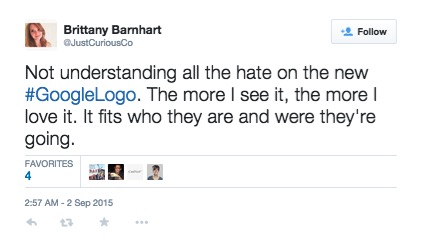
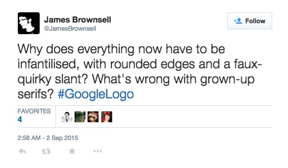
Google’s graphic transition was simply one from serif – which is typeface with the little nicks at the ends of the individual letters – to sans serif. With a brand so ubiquitous, there’s no doubt going to be widespread industry and public response to its new look, be it positive or negative:
<iframe width=”560″ height=”315″ src=”https://www.youtube.com/embed/olFEpeMwgHk” frameborder=”0″ allowfullscreen></iframe>
(To note, Google’s new upcoming parent company, Alphabet, will also be adopting the san serif typeface.) [Source]
On the other end of the spectrum, Apple discussed a variety of new hardware during their fall event in San Francisco, including new iPhones, upgraded Apple TV, the iPad Pro, and added features to just about everything. With market reach in music, telecom, television and more, Apple is definitely not keeping it simple.
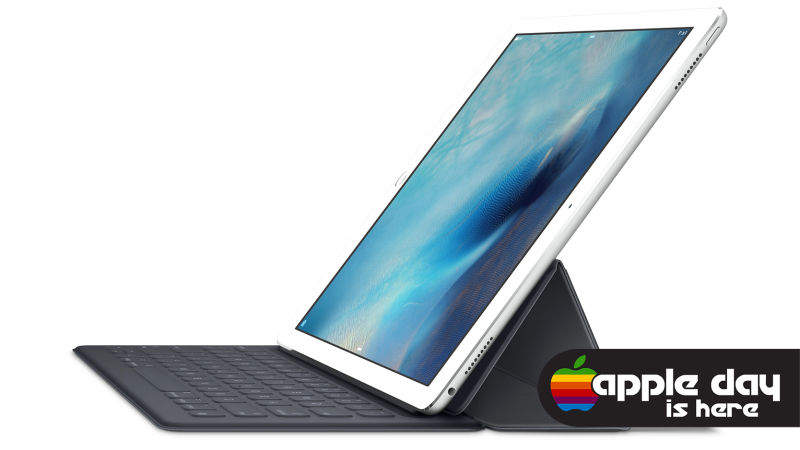
While Apple is pulling out all the stops, their stock price remains flat and they’re receiving some criticism regarding the innovations, such as the iPad keyboard (aka surface clone). However, the consumers will have the final say—the option of Siri in your TV may sound appealing, but is a $99 stylus beyond your technical desires?
What do you think? Can brands catch more customers with simplicity or variety?